31

Update May 26, 2016

Thanks for all your feedback. Please continue to provide further feedback if you have it. Based on the comments I've received so far, here are the updates that you should see updated this afternoon:

  1. Header -- The navigation size has been reduced as well as the logo. (Request)
  2. Answered Color -- The answered and accepted answer status in the question list has been updated to a more desaturated green. (1, 2)
  3. Header Styles -- These have been updated so that the post preview looks like the actual post. (Request)
  4. Icon Misalignment for "Meta User" -- This has been corrected. (Request)
  5. Footer -- The gradient has been removed and a Mode Line styling has been added. (Request)
  6. Tags -- These now have a light background behind them to push them off from the page.
  7. Badges -- The colors have been brightened.
  8. Meta Logo -- The logo will be updated to (emacs 'meta) (Request)
  9. Meta Red -- This will be updated to a more desaturated red color. (Request: 2, 3)

...

Concerning Badges

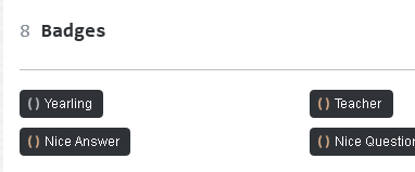
Beyond brightening the badge colors, I didn't change these. Opinions gravitated quickly around an idea where the icon would be ditched in place of wrapping the badge total within parentheses (e.g. (#) (##) (###)). While I think the idea fits this community theme rather well, I am not able to do this without creating a lot of custom CSS. All Stack Exchange network sites follow the same [icon] [#] format.

Here is what we can do:

  • (**Current Choice**) Brighten colors within current icon
  • Revert the badge icons to the default style (like on Stack Overflow or Meta Stack Exchange).
  • Use a different icon/symbol to represent badges.

If you (the community) wish the badge icons to be changed, please let me know how you like it updated and I will make the necessary adjustments.

Please vote in comments here.

...

Concerning Tags

Again, opinions here were a bit varied. Some liked the quote. Others didn't. All seemed to agree that a background should be added. Before I change the tag styles I'd like to get a better idea of what you want. Here the options:

  • (**Current Choice**) Add a background color and leave it as is
  • Remove the quote and go with a standard tag style
  • Replace the quote with a colon (for a :keyword style) (Request)

Please vote in comments here.

...

Those are all the updates I have. Thanks again for your feedback!


Original Post: May 24, 2016

Chuck Norris says great job

Congratulations! As you can see, the new site design is live.

Along with the site design, the newsletter and chat room will also adopt the new site theme. Reputation levels have been adjusted too.

If find any design/styling bugs, please start a new post and tag it with and .

Thanks and congrats on the new site theme!

5
  • Thank you, great job overall! I absolutely love the use of parentheses for showing badge numbers! I hadn't thought of that and was pleasantly surprised by it when I checked out the new design for the first time today :) It's a neat idea, and I vote for keeping it.
    – itsjeyd
    Commented May 25, 2016 at 7:44
  • I must say that I'm disappointed if the (#) (#) (#) and (# # #) ideas for badge counts are being discarded without comment on meta.emacs.stackexchange.com/a/422 which implements the former in only a small amount of CSS (with no markup changes required). I suspect that it wouldn't take much more to replace the textual parentheses of that approach with the original graphical background parentheses, but I don't think that's even necessary for this site -- there's no particular reason why the parentheses shouldn't be actual text.
    – phils
    Commented May 26, 2016 at 23:02
  • For the tags, I think your original no-background version looks really great in all situations cases except for the main Tags page, where it gets a little hard to see what's happening. I'd be happy with a background on the regular tags on that page just so each one stands out, but in general I think a background detracts from the design. If a "Tags page only" background is out of the question for any reason, I'd still vote for background-less (I simply don't spend much time ever looking at the Tags page).
    – phils
    Commented May 26, 2016 at 23:28
  • 1
    @phils Re: Badges -- The problem isn't the size of the CSS. It's the maintenance cost of having one site out of the 140+ sites we maintain on the Stack Exchange network do this one thing differently. Any changes we might want to make concerning badges will now be slowed. This is spoken from experience of allowing too many earlier communities have too many custom styles which inhabited our ability to roll out updates easily.
    – Hynes Staff
    Commented May 27, 2016 at 2:48
  • Ah, well that's a more understandable argument. I would vote for the default icon over the current custom icon.
    – phils
    Commented May 27, 2016 at 5:22

19 Answers 19

15

Nice!

The quoted tags without a distinctive background are different from what other Stack Exchange sites, but they aren't bad. I'm fine with them.

I do have one nitpick which is the Meta logo. It looks Lisp-like, but unfortunately when seen as Lisp it doesn't make sense. (emacs (meta)) is “emacs of meta”, it's the wrong way round: “meta of emacs” should be (meta (emacs)). Another possibility that makes sense would be (emacs 'meta) (emacs with the “meta” option). (emacs 'meta) has my preference because “,site-name meta” — er, I mean “<site name> meta” — is the way it's shown on almost every other meta.

5
  • 4
    Vote for (meta (emacs))
    – phils
    Commented May 25, 2016 at 22:53
  • 16
    Vote for (emacs 'meta)
    – phils
    Commented May 25, 2016 at 22:53
  • I like both of these suggestions, and clearly so do others. If you like one more than the other, vote up the appropriate comment.
    – phils
    Commented May 25, 2016 at 22:58
  • @phils I've added my preference to my answer, because there's actually an objective reason for it. Commented May 25, 2016 at 22:59
  • Either of these would work. Let me know which one the community prefers and I'll update the logo.
    – Hynes Staff
    Commented May 26, 2016 at 13:43
12

Update: Thanks for the upvotes but this won't work for technical reasons.

See this comment from a Stack Exchange employee.


The empty parens on the badges display are a bit jarring.

badges display as of 20160525

How about this? Note that the numbers are the same color as the parens (gold, silver, bronze).

proposed badge display

This suggestion comes from @Kaushul Modi in https://emacs.meta.stackexchange.com/a/411/870.

5
  • p.s. I love the 'tags!
    – daveloyall
    Commented May 25, 2016 at 16:38
  • Thanks for mocking that up. I would happily vote for this version of the badge counters.
    – phils
    Commented May 25, 2016 at 22:25
  • The markup really isn't as helpful as it might be, but even if it's unchangeable, I believe a sibling selector can be used to achieve this. e.g. (1) Adjust the existing background for .badge1; (2) Colour the text with .badge1 + .badgecount { color: ... }; (3) Add the closing paren with a background on .badge1 + .badgecount:after; (4) repeat for .badge2 and .badge3.
    – phils
    Commented May 26, 2016 at 8:20
  • I've implemented a version of that approach here: meta.emacs.stackexchange.com/a/422
    – phils
    Commented May 26, 2016 at 11:51
  • I agree; they're irksome to look at and they don't even really make sense in a Lisp context, since expressions are supposed to go inside parens.
    – GDP2
    Commented May 31, 2016 at 19:49
9

I like the makeover! Thanks!

Things I like

  • (emacs) and the blue/white theme
  • Tags with single quotes as prefix: 'some-tag
  • I in fact like the red meta. Also I fail to see the pink background that Drew referred too. IMO the meta site looks fine.

Things that don't blend in that well

  • The () GOLD# () SILVER# () BRONZE# do not seem to blend in well. How about (GOLD#) (SILVER#) (BRONZE#) -- e.g. (1) (4) (12) -- where the numbers have the same color as the parentheses (gold/silver/bronze)?
  • The answered questions' vote count area has a solid green background. I realize the answered questions need to stand out. But may be experiment with a transparent green background instead of the solid green?

Overall I would say that this is a great job!

3
  • 2
    Oh, I like that monospace font use in the headings! Commented May 24, 2016 at 21:40
  • 1
    I think the sold/silver/bronze suggestion here could be worth trying. I suspect that :before and :after pseudo selectors could facilitate the approach (although maybe simplest to first mock up a screenshot for people to vote on to see whether it looks good enough in practice? I'd certainly like to see how that looked...)
    – phils
    Commented May 25, 2016 at 6:22
  • Unfortunately badges are set up in a [icon] [number] format and this cannot be changed. I am able to brighten the colors, revert to filled circles or try a different shape though (like this one suggested by Gilles).
    – Hynes Staff
    Commented May 26, 2016 at 13:47
7

Well here's a version of the badge counts using the (#) format. As I presume the real CSS with its background sprites is generated from SASS or LESS or some such, I'm not using the parentheses image at all for this version (as the necessary background positions would be prone to change). This version is all just coloured text.

/* Badges */
.badge1, .badge2, .badge3 {
    display: none !important;
}
.badge .badge1, .badge .badge2, .badge .badge3 {
    display: inline-block !important;
}
.topbar .topbar-links .topbar-flair .badge1 + .badgecount,
.badge1 + .badgecount {
    color: rgb(200, 180, 0) !important;
}
.topbar .topbar-links .topbar-flair .badge2 + .badgecount,
.badge2 + .badgecount {
    color: rgb(142, 142, 142) !important;
}
.topbar .topbar-links .topbar-flair .badge3 + .badgecount,
.badge3 + .badgecount {
    color: rgb(205, 127, 50) !important;
}
.badge1 + .badgecount:before,
.badge2 + .badgecount:before,
.badge3 + .badgecount:before {
    content: ' (';
}
.badge1 + .badgecount:after,
.badge2 + .badgecount:after,
.badge3 + .badgecount:after {
    content: ')';
}

badge count parentheses

or, with my actual top bar:

badge count parenthesis 2

edit1: Having done this, I'm also wondering whether a (# # #) version would look even more apropriate (with either just the numbers coloured, or with each paren having the same colour as the adjacent number -- which would be fiddlier, but maybe worth it if it enhances the visibility of the colours).

Just mocking that up in gimp:

badge count as list

5
  • You are on a roll! Thanks for doing this. I hope all your custom CSS gets integrated. Commented May 26, 2016 at 12:00
  • 6
    Vote for: (#) (#) (#)
    – phils
    Commented May 26, 2016 at 13:34
  • Vote for: (# # #) with coloured parens
    – phils
    Commented May 26, 2016 at 13:35
  • 4
    Vote for (# # #) with plain parens
    – phils
    Commented May 26, 2016 at 13:35
  • The current CSS above (now) leaves individual badges as they were originally, but modifies the badge counts everywhere (so far as I can see). I like it. User profile pages are pretty snazzy. I've looked into styling the individual badges too, but (1) that looks unreliable (I could only see .badge[title~=gold] etc as useful selectors, but that's horrid, and obviously the titles are language-specific); and (2) it simply didn't look as good. I'd be pretty happy with this as-is, however -- the () prefix looks better inside the individual badges than it does for the badge counts.
    – phils
    Commented May 27, 2016 at 1:25
6

Here's a suggestion for adding M-x into the design.

M-x on hover

(The idea, of course, being that each of the main tabs is like a named command.)

It's only on hover, and faded as well, in order that it doesn't seem like a clickable button.

/* M-x */
#hmenus:hover:before {
    content: "M-x";
    font-family: monospace;
    font-size: x-large;
    font-weight: bold;
    margin-right: 1em;
    color: #ccc;
}
2
  • What does M-x represent?
    – Hynes Staff
    Commented May 26, 2016 at 13:39
  • 2
    M-x is the Emacs key notation for holding the Meta modifier key (which is actually 'Alt' on most modern keyboards) and typing x. Spoken as "Meta x". It is the default key binding for the Emacs command which allows you to enter absolutely any named command (at a prompt which is also the string M-x). Hence this character sequence is fairly iconic for Emacs users, and instantly recognisable. In my suggested styles, the M-x represents the prompt, with the user about to 'type' a command.
    – phils
    Commented May 26, 2016 at 14:28
5

Badges Poll

Please vote in the below comments

  • (**Current Choice**) Brighten colors within current icon
  • Revert the badge icons to the default style (like on Stack Overflow or Meta Stack Exchange).
  • Use a different icon/symbol to represent badges.

I cannot vote on my own comment, but I would vote for the () style. It's unique and I already got used to it.

11
  • 4
    () style with brigthened colors Commented May 27, 2016 at 12:10
  • 6
    default • style Commented May 27, 2016 at 12:10
  • 1
    M/C/S style that Gilles proposed Commented May 27, 2016 at 12:10
  • 1
    something else .. Commented May 27, 2016 at 12:11
  • 1
    To me the top bar is high-level as in Stack Exchange level bar. To keep consistency across all SE sites, it should look the same and have the same functionalities everywhere. Each site can customize the content of the page (ie. everything but the top bar). Commented May 27, 2016 at 12:21
  • 2
    @MathieuMarques Lots of the custom sites customize the top bar. gaming.se has coins, travel.se has location pointers, academia.se has graduation caps. They all have the same functionality, but many customize the appearance.
    – Ryan
    Commented May 29, 2016 at 14:38
  • 1
    @Ryan Sure, this is just a personal opinion that the top bar should be "meta" and be consistent throughout all sites. Commented May 29, 2016 at 14:41
  • I get the impression that there is something that prevents us from using this: meta.emacs.stackexchange.com/a/422/870 ...but I don't know what it is. What is it?
    – daveloyall
    Commented May 31, 2016 at 22:26
  • @daveloyall: See meta.emacs.stackexchange.com/questions/408/… . It's unfortunate, but I do appreciate where it's coming from. Those of us who are keen on my alternative CSS can still use it in a custom stylesheet, at least.
    – phils
    Commented Jun 2, 2016 at 4:20
  • Thanks, @phils. OK, I've changed my vote from 'something else' to 'default • style'. But I can't actually remove my upvote from the first one, so actually I voted twice. ;) No matter.
    – daveloyall
    Commented Jun 2, 2016 at 14:59
  • My suggestion: use C-u for the icon.
    – asmeurer
    Commented Jun 5, 2016 at 17:48
4

I have nothing against the () badge logo myself, but there seems to be quite a lot of dislike against it.

We all want to work in an allusion to keyboard bindings somewhere. So how about making the badges look like S- for bronze, C- for silver, M- for gold? The colors already reveal the badge colors so the letter association isn't critical, but the order shift-control-meta follows the “less magic” to “more magic” order of modifiers (shift doesn't make things more magic, the most basic commands use control, and M-x and M-: which prompt for a command to run use meta).

Proof-of-concept with my crappy drawing skills: enter image description here

2
  • How about just using M-x for all three? I like the idea of S/C/M, as it doesn't make emacs.SE look like it's really lisp.SE, but I didn't even realize that's what those letters stood for until I read this (and M1 instead of M-1 doesn't help).
    – asmeurer
    Commented Jun 5, 2016 at 17:40
  • Or useC-u for all three.
    – asmeurer
    Commented Jun 5, 2016 at 17:41
4

I think the bottom menu could be given a little bit of Mode Line styling, to nice effect.

Just a monospace U:--- on the left hand side, and a trailing --- on the right hand side (faded, so as not to appear like something clickable).

I realise that coding sequence won't be the norm for everyone; but I picked the GUI format over the terminal format (as the user is most likely using a graphical web browser), and this site uses html5 (which is utf-8 by default), and so the U makes sense in that context. I wondered whether to use the 'read-only' or 'modified' syntax, but writeable & unmodified seemed the most appropriate for a Q&A web site -- and also looks a little nicer IMO. (I do realise the right-hand hyphens are now a terminal-only thing, but I wanted the balance.)

Something like this...?

mode line bottom menu

(screenshot is with the gradients removed, as per my earlier answer.)

/* Mode Line */
.top-footer-links:before {
    content: "U:---";
    float: left;
    color: #abf;
    font-family: monospace;
}
.top-footer-links:after {
    content: "---";
    float: right;
    color: #abf;
    font-family: monospace;
}

A larger font size for these is maybe even better. I think font-size: 18px; is quite good -- but perhaps fade the colour slightly more at the larger size. #93b1ea (a quick tweak of the actual background) seems quite reasonable to me.

larger font size

Bonus points: Add Javascript to convert the : into (Unix), (Mac), or (DOS) depending on the user agent :)

Double bonus points: If one of those AJAX "a new answer has been posted", or "a question has been updated" notices comes through, change the mode line to U:**- :)

2
  • Thanks for adding this in the update, @Hynes :)
    – phils
    Commented May 26, 2016 at 23:09
  • The mode-line effect is not pronounced enough to be recognizable as such, IMO. Maybe with a fixed-width font it would work OK. The U:--- could be 1\%%- , as in Dired for emacs -Q. That's more recognizable and is cryptic enough to someone who doesn't recognize it that they might well assume it's an emacsism, not a footer link. Also, the --- before and after the links should be separated from the links by no more than one space.
    – Drew
    Commented May 30, 2016 at 2:17
3

I really like the design! The the only "problem" I found (it's really minor, OCD-level) is that "Meta user" is squished against "(e)" on the profile page:

Profile emacs.stackexchange.com

It looks a little cleaner on StackOverflow:

Profile stackoverflow.com


Aside from quoted tags and monospaced fonts, my favourite aspect of the new design is the use of parentheses for badges. It's a neat idea that sets our site apart from other sites in the StackExchange network.

1
  • Thanks for the report. This is a network-wide bug.
    – Hynes Staff
    Commented May 26, 2016 at 18:14
3

Yays

  • Badges, although perhaps make them a little brighter if the idea is kept
  • Monospaced things there and there

Nays

  • Gradients
  • Choice for colors (both Meta and standard sites). It's a little too blue and not enough purple; and as for Meta, red doesn't fit (too warny)
  • The buttons are probably too big (eg. "Questions", "Tags")
  • Some tags are hard to see and this makes it harder to read through the page tags (/tags). Though they are fine as is under posts.
  • The preview when editing an answer doesn't reflect the changes of styles

Also, what is the reasoning behind the parentheses around "meta" in the title?

3

I really like the quoted tags. I think that works very well.

In general, I do quite like the new design, but there are a bunch of things I find jarring:

I agree with some of the others that the bronze/silver/gold badge counts don't look good with the number following both parentheses, but moving the numbers inside the parentheses would make it all better.

High contrast on non-critical regions is almost always a mistake. Anything which pulls your attention away from the content is bad, basically. Right now I'm seeing a sidebar box with a bright blue+gradient outline, for instance, which is pretty awful. If you could make these things blend in rather than stand out, that would be much appreciated.

(Toning down the green boxes would be great too. I know that this was a recent StackOverflow change, and I don't know whether we've just inherited that, or if this one is a choice. Or maybe it was like this before, and it just seems new in context?)

I'm definitely not a fan of the colour gradients. Maybe that's inspired by the new Emacs logo? (which I dislike for the same reason -- the previous logo was much nicer... it wasn't flat colour, but it was aesthetically pleasing). I would personally ditch the gradients in all cases. The one in the site logo is probably the most acceptable to my mind. The title underline doesn't look good (almost ignorable, mind, until you notice it...). The footer looks really bad. Nothing in Emacs renders like that. The GUI versions get a few bevel effects here and there, but basically it's flat colours everywhere for pretty obvious reasons. I think the Emacs logo makes a very poor basis for any kind of visual design for emacs.stackexchange.com, so it's unfortunate if that's what's happened here.

(I also don't think the general shade of blue that's used for some of the important UI components is the best match either, tbh, but I think it's mostly those gradients which are really bugging me.)

I think that's it for criticism. Fix the badges. Ditch the gradients. Tone down the contrast. :)

edit1: Ditch the background image. Although it's very low contrast (I didn't notice it at first), I'm filing this under the same category as the contrast issue -- it's simply distracting (now that I see it), for no benefit. Flat colour, please.

edit2: A user stylesheet (for Firefox + Stylish) to deal with the backgrounds and gradients:

@namespace url(http://www.w3.org/1999/xhtml);

@-moz-document domain("emacs.stackexchange.com")
             , domain("meta.emacs.stackexchange.com")
{
  /* Eliminate unwanted background images and gradients */
  body,
  #footer .footerwrap #footer-menu .top-footer-links,
  #newsletter-ad {
    background-image: none !important;
  }
  #question-header {
    border-image: none !important;
    border-color: #ccc !important;
  }
}
5
  • If you click the Tags tab to see the list of tags, do you really find it more readable with all the quote marks? Just curious, as I find it quite a bit less readable that it was before (or that it is on other sites).
    – Drew
    Commented May 25, 2016 at 0:01
  • 1
    I agree -- I do find the new style rather messy on that particular page (I hadn't looked at it until now). I like it for the questions and question listings, however.
    – phils
    Commented May 25, 2016 at 0:43
  • 2
    Many (most?) of the tags have no background shade, which makes it all the harder to parse (IMO).
    – Drew
    Commented May 25, 2016 at 0:55
  • @Drew +1 Simply having a light background shade should fix that (display of the 'TAG tags on the Tags tab). Commented May 25, 2016 at 2:55
  • @KaushalModi: Sure, it would help.
    – Drew
    Commented May 25, 2016 at 4:41
3

Tags Poll

  • (**Current Choice**) Add a background color and leave it as is
  • Remove the quote and go with a standard tag style
  • Replace the quote with a colon (for a :keyword style) (Request)

I cannot vote on my own comments, but I would vote for the :keyword style, with an enhancement that the : part be in a little desaturated color. So for example, if :org-mode is displayed, : would be gray in color and org-mode would be darker. That way, the actual tag will stand out. And also the whole thing will have a subtle background color.

5
  • 6
    current 'TAG style with background color Commented May 27, 2016 at 12:15
  • 3
    standard TAG style like on other sites Commented May 27, 2016 at 12:16
  • 2
    :TAG style as Dmitry proposed Commented May 27, 2016 at 12:16
  • 1
    My vote is to revert to the original no-background 'TAG style (preferably with the background added for (only) the "Tags" listing page, where some additional emphasis is more helpful for distinguishing where the information for each tag starts and ends).
    – phils
    Commented May 29, 2016 at 5:54
  • 1
    Standard (no quote or colon), but with the fixed-width font that is currently used. Definitely with a background shade.
    – Drew
    Commented May 30, 2016 at 2:10
2

Great job, well done! I'm not a real fan of gradients, but the site looks beautiful.

2

Thanks. It looks good overall, with many neat ideas, which show a lot of care was taken, I really appreciate it. Among those ideas I only noticed 2 which don't work well for me:

  • The use of () instead of a bullet for badge counts. The idea is cute, but it makes the thing hard to read. If we can have (#N1) (#N2) instead, it might work better.
  • The use of monospace for the top menu ("Questions Tags Users ..."). It reminds me of the ugly menus we had back in Emacs-19. That same monospace works well for "active oldest votes" and tag names, OTOH.

BTW, how 'bout renaming (emacs (meta)) to something like M-emacs? Or otherwise integrate M-x somewhere.

1
  • 2
    While I like the idea of M-emacs for the meta logo, I think it's important that the presentation of all meta sites across SE remains reasonably uniform. M-emacs is an in-joke that only people who are sufficiently familiar will get. Commented May 25, 2016 at 19:56
2

Thanks are in order for everyone's efforts, of course.

But if feedback is still welcome, here is mine, FWIW:

  • I would like to lose the RED on Meta. All of it. It is especially annoying when used for a large block of text. But it is also annoying in general. There is really no EMERGENCY!!! to alert people to.

  • Also annoying (to me):

    • The big bright green boxes around accepted answers.
    • The pink background on Meta.
    • The grayed-pink background for the non-meta part of the site.
    • The pink background for code on the non-meta part.
  • I don't think that () works well for showing numbers of badges. Cute should be weighed against readable and meaningful.

  • Likewise wrt quoting tag names, although this is minor. Less cute would be better here too.

The new look is a bit like a wrinkled, jaded, 90-year old Hello Kitty.

Just one opinion (sorry). I will get used to it, of course.


Let me add that the use of blue on non-meta looks fine. And the logo is nice. It is mainly all the red text on meta that I will have to get used to. (Fortunately, I visit meta a lot less often.)


UPDATE After Updated Look & Feel

Looks much better. Thanks. No more bright green accepted-answer box, less-bright red on meta (though I'd prefer it darker still), background on all tags, etc. Big improvement, IMO.

One thing I like less, however: the lighter blue text than before (?). Not great on a white background. Please consider more light/dark contrast. But I see that there are other SE sites with a similar link color, including StackOverflow. Not a big deal, I guess.

4
  • 2
    "Hm. I didn't realize the site was being redesigned." -- You were involved in the site redesigning ideas meta question here! Commented May 24, 2016 at 21:39
  • Ah yes, I guess I saw the initial announcement. I didn't see the followup proposals. Sorry.
    – Drew
    Commented May 24, 2016 at 23:28
  • I'll look at desaturating the red on Meta.
    – Hynes Staff
    Commented May 26, 2016 at 13:50
  • @Hynes: Great. I think that would do the trick. Consider maybe using a dark red (almost brown) - something like FireBrick. Anyway, thanks.
    – Drew
    Commented May 26, 2016 at 14:06
1

What about the Badges tab on the Profile page?

If the (#) (#) (#) or (# # #) suggestions are accepted (and it looks like they will be, woot!) then these should be altered to match, right?

badges tab on profile as of 20160526

Should they become (Badge Name) or 'Badge Name? I might have answered my own question with that space character in there... :)

3
  • As I mentioned in this comment, we are unable to modify the badge layout (like this: (#)). Also we are unable to change the badge style to (Badge Name) as this would affect the layout for every other Stack Exchange community.
    – Hynes Staff
    Commented May 26, 2016 at 15:12
  • Hynes: I agree that the styling displayed in this answer is a more awkward case than the others, however I really hoped that my own answer demonstrating how to display in a (#) format with a small amount of CSS and no markup changes at all would be sufficient to at least put this (fairly popular) suggestion to the vote, rather than discarding it as too hard.
    – phils
    Commented May 26, 2016 at 22:47
  • daveloyall: FYI I think that modifying the individual badges is a no-go. As far as I can tell, the current markup just doesn't facilitate it (at least not in a clean and translatable fashion). Moreover when I tried it, it didn't actually look very good. Personally, though, I don't mind the () prefix nearly so much for this individual-badge case, so leaving these alone doesn't bother me, as I think they remain relatable to the numeric counts in (#) form.
    – phils
    Commented May 27, 2016 at 2:40
1

Love the new colors and the background, but I think the quotes in tags is kinda tacky. In Lisp, the quote is not a part of the value, it's just syntax; and tags show values.

There are :keywords, however, and they do evaluate to symbols whose names begin with colons. I think tags would look better with colons.

1
  • Tags are names with associated metadata, including a more detailed description "value". I think a quoted symbol name fits this requirement suitably well.
    – phils
    Commented May 27, 2016 at 2:48
1

Good job and congratulations. Hope this is a start of more new things for emacs.

Suggestions for future improvements:

  • gradient colors, get rid
  • make site more compact and readable
  • too much white space
  • inconsistent fonts/colors for keywords
  • get rid of blank parens (); instead use them to enclose numbers (9) or (text)
  • if you need more prefix characters, use # or :
  • avoid using quote and back-quote characters ' and `
  • overall design is a bit old-style, no spark, nothing exciting
0

Is the logo also up for discussion? I think instead of (e) it should be M-x. This would be more recognizable to people, and it makes emacs.SE look more like emacs.SE, not lisp.SE.

I'm also not a fan of the color and gradient, but as I'm not a designer, I have nothing better to offer.

1
  • The logo is not up for discussion at this time.
    – Hynes Staff
    Commented Jun 6, 2016 at 13:48

You must log in to answer this question.

Not the answer you're looking for? Browse other questions tagged .