8

My name is Joshua, and I'm a Senior Product Designer at Stack Overflow. And, congrats, I will be working on your community's site design. Huzzah!

Celebrate! Celebrate!


Okay now for the questions.

As I begin the design, I'd love to hear some thoughts from you on how I can best represent this community.

  • What are some visual cues that people instinctively know as "Emacs"?
  • Where can I go to learn more about Emacs (beyond the random Wikipedia article)?
  • Is there a design style / aesthetic that you think would be a good fit for this community?
  • If you had to describe this community in 5 words, what would those words be?
  • If this community were a movie, what would it be?
  • Which symbols or styles should be avoided?

Thank you for all your help and congratulations!

1
  • 8
    M-x is immediately recognized.
    – Drew
    Commented May 5, 2016 at 22:00

4 Answers 4

6

One visual cue would be the logo:

Emacs logo

The official webpage will tell you more about Emacs.

If this community were a movie, it would be Braveheart.

They may take our lives, but they'll never take... OUR FREEDOM!

(This is because Emacs is closely associated with the GNU project, an operating system composed entirely of Free Software. Emacs users are likely to value the freedom to modify their programs as they wish. This value is intrinsic to the design of Emacs: It is a programming environment for itself, complete with documentation and links to the source code for nearly all its internals.)

This symbol should be avoided:

The logo of the beast

(The above "Logo of the Beast" is sported by a competitor editor program called "Vim." There is an old rivalry between Emacs and Vi [and Vim, Vi's successor.])

1
  • 3
    -1 for Vim logo included in the answer .... Hahaha
    – Prasanna
    Commented May 5, 2016 at 1:38
3

Emacs is a text editor that's been extended to do many other things that involve a user interacting with text (and the occasional image), such as reading email, browsing the web, posting on Stack Exchange, maintaining a to-do list or a project plan, managing files, etc. What distinguishes Emacs from other text editors is primarily its versatility. If there's any single image that's associated with it, it's the kitchen sink — many systems used to have a kitchen sink as the icon to start Emacs, though it's fallen out of fashion.

The Gnu is sometimes associated with Emacs, but that's only because it's the emblem of the GNU Project and Emacs is one of the GNU project's flagship software. (There are other implementations of Emacs, in fact, but GNU Emacs is the only one in common use today, so Emacs is practically synonym of GNU Emacs. I don't think we have any question on the site that is specifically about a different Emacs implementation.)

If you look at the main Emacs resources on the web — the official site and the wiki — you'll notice that they don't have a strong visual identity. Until very recently, the official site didn't have a distinct visual identity from the rest of the GNU site, and it's pretty sober. Even today the identity doesn't extend to pages such as the manual which remain very plain. If you want a little more inspiration, here are a few of the most popular Emacs plugins (distributed through GNU ELPA or MELPA): Org mode, Magit, Helm, Auto-Complete, AUCTeX. Black on white with the browser's default font is a strong trend. Emacs users tend to be more interested in than in .

3
  • What are some visual cues that people instinctively know as "Emacs"?

Emacs is strongly associated with the Lisp language, which in-turn is based on functional programming and lambda (λ) calculus. Many languages have been derived from this modest start, including elisp, which is the specific lisp dialect in Emacs. They use parenthesis prominently and over the years the parenthesis character came to be associated with the lisp, elisp, and by extension, Emacs.

  • Where can I go to learn more about Emacs (beyond the random Wikipedia article)?

The main GNU Emacs project page, https://www.gnu.org/software/emacs/ is the place to start.

  • Is there a design style / aesthetic that you think would be a good fit for this community?

A good fit would be emacs itself: economy, simplicity, devoid of clutter, ornamentation, and affectations. The aesthetic it espouses is the efficiency of finishing the task at hand and not how many widgets or colors or icons one has to become familiar with before becoming productive. In this world of swift efficiency, even one extra keystroke is a burden to be avoided. Yet that has not stopped endless colorful themes, widgets, pop-ups, and do-dats in Emacs. Many other editors are entirely emulated inside Emacs even if users are warned it is evil. When the Emacs community wakes up to a new idea, you can bet there would be one implmentation in Emacs by lunch, and several advancements by day's end. Longtime SO Emacs community members come from this background.

  • If this community were a movie, what would it be?

A bad movie because there is no drama.

  • Which symbols or styles should be avoided?

Baroque, rococo, ornamentation, emojis, buttons shaped like pills and multi-colored Skittles.

4
  • Can you explain what you mean by "multi-colored Skittles"?
    – Hynes Staff
    Commented May 6, 2016 at 19:44
  • I can't explain as well as these pictures.
    – Emacs User
    Commented May 6, 2016 at 20:03
  • Ha. Well I understand what Skittles are. I'm not sure how that answer fits in your with comment on symbols or styles to be avoided.
    – Hynes Staff
    Commented May 6, 2016 at 20:05
  • I agree with the main project page (linked in this answer) as a really good place to get a sense of the design Emacs users find favorable. I would say that purple color from the logo (featured prominently there) is recognizable enough at this point, but I would try to remain at least as understated as on that site.
    – user2267
    Commented May 8, 2016 at 16:31
3

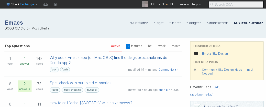
Using Gilles ideas:

enter image description here

All actions are in braces, e.g.:

(share) (edit) (close) (flag)

ASCII pseudo graphics when ever possible:

^
5
v
*

Tags are lisp symbols:

'osx  'path  'ispell
2
  • 1
    Instead of the oval background with solid borders behind tags, how about the background be made rectangle with subtle change in color and no solid borders. I am thinking of something like the highlighting of <code> blocks in red fonts here. Commented May 13, 2016 at 19:18
  • 1
    The *Questions*, *Tags*, etc might look better if they have a different font color and some emphasis. Commented May 13, 2016 at 19:19

You must log in to answer this question.

Not the answer you're looking for? Browse other questions tagged .