7

The current favicon is a bit vague: a speech bubble containing the letters "EM".
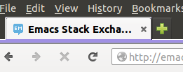
screenshot

It's okay once you know what it is, but it doesn't really suggest "Emacs" to me.

(No offense intended to whoever made it -- it's not an easy format to work with. Although I see now that it's a pretty common look for sites on the network, so I guess it wasn't designed for this site as such.)

Do we want to change it? Does anyone have a better idea which would work in a 16x16 pixel format?

Speech bubbles are clearly a theme, but a few sites have made them their own. Perhaps stylised parentheses would make an appropriate bubble for us?

I tried to make "M-x" work in a bubble, but I don't think there's enough space for that. Perhaps just a question mark would be better, if the rest of the icon was distinctive.

My rubbish gimp skills could only manage this as a general impression of what I was thinking:

screenshot

I'm sure it could look a whole lot better than that, though.

Perhaps a better idea would be the sequence C-h (with no bubble) ?

1
  • 2
    The current icon is just a default for beta communities. Visit other betas and you'll see. I don't think you're offending anyone. :-)
    – Malabarba
    Commented Oct 9, 2014 at 7:16

3 Answers 3

14

This would be good (tour icon):

enter image description here

16x16 favicon

enter image description here

4
  • Does the favicon need to be blue?
    – T. Verron
    Commented Oct 10, 2014 at 10:32
  • @T.Verron No, but beta icons are usually with blue background (craftcms.se, however has red one). What color do you think would be better? Purple (violet)?
    – nicael
    Commented Oct 10, 2014 at 12:36
  • 3
    If we are allowed to (both by stackexchange and by the FSF), we could use the same color as in the emacs icon.
    – T. Verron
    Commented Oct 10, 2014 at 12:58
  • I don't think the FSF can prohibit us from using a particular color, but I suppose it would be nice to ask, still.
    – tripleee
    Commented Oct 20, 2014 at 8:16
3

I like the idea of using C-h with some form of decoration (if it fits). I think it'd be better than M-x.

7
  • 2
    We need an icon associated with Emacs, to stand out among other Q&A sites. Not an icon associated with Q&A. Commented Oct 9, 2014 at 15:17
  • @Gilles yeah. C-h is a little too generic
    – Malabarba
    Commented Oct 9, 2014 at 15:19
  • 1
    Too generic? I mentioned it in the question because I thought C-h very clearly indicates "Emacs Help" (at least to an Emacs user), and wasn't a generic Q&A icon. Of course I'm basing that on an assumption that this key sequence notation isn't especially common elsewhere; maybe I'm wrong about that?
    – phils
    Commented Oct 10, 2014 at 5:49
  • @phils I was thinking there are probably other utilities that use C-h for help, but I also don't know. Regardless, 3 characters is too much to fit into a favicon, I'm afraid. =/
    – Malabarba
    Commented Oct 13, 2014 at 9:54
  • @Malabarba Most of them would "spell" that as Ctrl-H, though: the C-h notation is only really used by Emacs users, and does suggest Emacs pretty well IMO.
    – amalloy
    Commented Oct 13, 2014 at 21:25
  • @amalloy Granted. :-) Still, it probably wouldn't fit anyway.
    – Malabarba
    Commented Oct 13, 2014 at 22:06
  • I actually like M-x better because it is so specifically Emacs.
    – tripleee
    Commented Oct 20, 2014 at 8:15
3

The first letter(s) of the site name is the default icon for beta sites. Only a few have a different icon.

A question mark wouldn't work, it could be anything. When I see your (?) icon, I see “question mark”, not “parentheses”. And Puzzling is already ??.

There are several icons associated with Emacs. GNU heads are associated with GNU Emacs; this site is about all Emacs variants (even if pretty much all questions are about GNU Emacs, which is the only version with ongoing lively development, apart from derivatives thereof), so this won't do. Other icons associated with Emacs include the kitchen sink. A kitchen sink icon (without the word GNU inside, to avoid any implication that this site is associated with the GNU project) would be nice.

There may be a kitchen sink icon with a liberal license that Stack Exchange could reuse, I haven't investigated this aspect.

2
  • 3
    I agree with your points, but I'm not a big fan of the kitchen sink, specially that one (I know you just linked it as an example). I'd be ok with a prettier sink, but if that's not possible (given the size constraint) then I'd prefer something else entirely.
    – Malabarba
    Commented Oct 9, 2014 at 15:27
  • Is it permissible for us to appropriate an official Emacs icon? I had assumed it would need to be something custom.
    – phils
    Commented Oct 10, 2014 at 5:55

You must log in to answer this question.

Not the answer you're looking for? Browse other questions tagged .